


How to Turn Complex Data Into an Easy-to-Follow Infographic

Data Storytelling • Visual Communication Make the insight obvious before you make the design beautiful. A useful infographic gives readers a clear path through information. It turns a crowded collection of numbers into something people can understand, remember, and explain to someone else. A spreadsheet can contain an important story and still make that story … Read more

How Context and Culture Shape the Meaning of Visual Symbols

An icon can look impressive on a large design canvas and become an unclear collection of lines in a navigation bar. Small-size clarity begins with the intended display size, not with a detailed illustration that gets reduced later. Icons work under tight constraints. They must communicate through limited space, remain distinguishable from neighboring symbols, and … Read more

How to Design Clear Icons That Stay Recognizable at Small Sizes

An icon can look impressive on a large design canvas and become an unclear collection of lines in a navigation bar. Small-size clarity begins with the intended display size, not with a detailed illustration that gets reduced later. Icons work under tight constraints. They must communicate through limited space, remain distinguishable from neighboring symbols, and … Read more

Design System Governance at Enterprise Scale: Semantic Versioning, Component Deprecation, and Multi-Brand Adaptation

Building a design system component library is relatively straightforward; governing and sustaining that system across hundreds of product designers, thousands of engineers, and multiple autonomous business units over several years is one of the most formidable challenges in modern digital product architecture. Without disciplined governance protocols, design systems inevitably fracture into rogue forks, uncoordinated overrides, … Read more

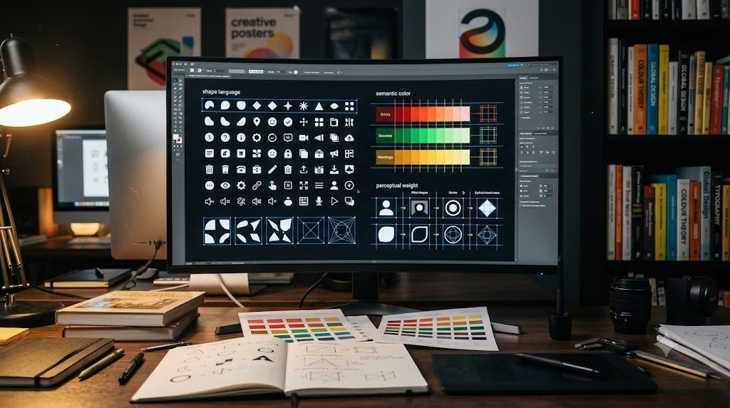
Engineering Cohesive Visual Grammars: Shape Language, Semantic Color, and Perceptual Weight

Why do certain digital products and consumer brands feel instantly cohesive, authoritative, and polished, while others appear disjointed and amateurish despite using high-quality individual assets? The differentiator is the presence of an underlying visual grammar. Just as a spoken language relies on syntax, phonology, and semantic rules to transform random words into meaningful literature, a … Read more

Enterprise Design Token Architecture: Atomic Design Methodology and Cross-Platform Tokens

As software organizations scale across multiple digital platforms—spanning web applications, native iOS apps, Android clients, and embedded automotive touchscreens—maintaining visual consistency through manual styling becomes an operational impossibility. Hardcoded hex codes, scattered CSS classes, and fragmented design files inevitably produce visual drift, accessibility regressions, and hundreds of hours of wasteful duplicate engineering. The enterprise solution … Read more

Modular Grid Systems and Swiss International Typographic Style: Mathematical Proportions and Rhythm

Modern digital design systems—from responsive CSS flexbox and grid layouts to enterprise UI component libraries—are the direct descendants of the Swiss International Typographic Style developed in Zurich and Basel during the 1950s. Designers such as Josef Mller-Brockmann, Armin Hofmann, Karl Gerstner, and Emil Ruder discarded arbitrary personal decoration in favor of a universal, objective visual … Read more

Typographic Architecture for Information Density: Optical Hierarchy, Leading, and Microtypography

Typography is the fundamental substrate of information design. While graphic designers frequently treat type as an expressive artistic brushstroke, information architects view typography as a precision structural grid for human reading cognition. In data-dense applications—such as financial terminals, aerospace cockpit displays, electronic health record (EHR) systems, and multi-column scholarly publications—typographic architecture determines whether users can … Read more

Procedural Instruction Design: Technical Diagrams, Spatial Exploded Views, and Ergonomic Flow

From assembling flat-pack Scandinavian furniture and operating medical diagnostic devices to performing emergency aircraft maintenance, procedural instruction manuals are the ultimate crucible of applied information design. When a technical diagram fails to communicate a critical sequence of actions clearly, products are damaged, consumer frustration boils over, and in industrial settings, severe mechanical injuries or equipment … Read more

About VisualGuide

About VisualGuide

VisualGuide is an authoritative engineering publication dedicated to information design, semiotic theory, atomic design token systems, and Swiss modular grid typography.

Learn More →
Design Theorists Semiotic models & graphic research
Grid Architecture Swiss typographic systems & visual hierarchy
Verified Quality Empirical analysis & peer-reviewed data